binary visualization
 5:37
Journey on the Deep Dream
598K views • 11 years ago
Roger Luedecke
A six-minute journey through the layers of a neural network using Deep Dream, with each frame fed back into the network starting from random noise and the targeted layer changing every four seconds. It is set to downtempo music.
 8:05
800+ days of Minecraft in 8 minutes
2.8M views • 13 years ago
Minecraft
A Gource visualization of 826 days of Minecraft development, from alpha 1.2 to release 1.5, condensed into eight minutes. Each dot is a file, folders are links, and developers fly around zapping files as they work on them.
 14:34
Visualization of Quantum Physics (Quantum Mechanics)
2.8M views • 9 years ago
udiprod
An animated visualization of basic quantum mechanics using a free particle, with simulations based on the actual equations. It covers waves, particles, and how measurement collapses the wavefunction.
 13:58
The Josephus Problem - Numberphile
7M views • 10 years ago
Numberphile
Numberphile with Daniel Erman on the Josephus problem, where people in a circle are eliminated in turn. It shows how the survivor's position follows a neat pattern tied to powers of two and binary.
 6:08
Immigration, World Poverty and Gumballs
6.8M views • 16 years ago
NumbersUSA
Roy Beck's short gumball presentation using World Bank and Census data to argue that letting people immigrate to the US cannot solve world poverty because the numbers are so large. It is made by NumbersUSA, an immigration-restriction advocacy group.
 5:50
15 Sorting Algorithms in 6 Minutes
29.4M views • 13 years ago
Timo Bingmann
A visualization and sonification of 15 sorting algorithms, from selection sort to bogo sort, run on shuffled integers in six minutes. Each algorithm gets a size and speed scaled to its complexity.
 12:54
I have APHANTASIA (and you may too...without realising it!)
8M views • 8 years ago
JAMIEvstheVOID
An artist describes discovering she has aphantasia, the inability to form mental images, and how it affects her work. She asks viewers about their own visualization.
 14:25
A Time-Lapse Map of Every Nuclear Explosion Since 1945 - by Isao Hashimoto
15.8M views • 16 years ago
aConcernedHuman
Isao Hashimoto's time-lapse map shows all 2053 nuclear explosions between 1945 and 1998, with each nation getting a blip and a running tally. Each second represents one month.
 9:16
Floating Point Numbers - Computerphile
2.5M views • 12 years ago
Computerphile
Tom Scott explains for Computerphile how floating point numbers work, why moving the binary point is fast, and why it handles money badly.
 11:42
See how the rest of the world lives, organized by income | Anna Rosling Rönnlund
881K views • 8 years ago
TED
Anna Rosling Rönnlund presents Dollar Street, a project photographing homes in dozens of countries, from stoves to beds to toilets, and sorting them by income. She shows how data visualization can change how we see the world.
 7:26
Tomorrow's World: Nellie the School Computer 15 February 1969 - BBC
113K views • 16 years ago
BBC
A 1969 BBC Tomorrow's World segment about Nellie, a school computer used by pupils at Forest Grammar School to solve equations and play music. Students learn programming and maintenance, and act out binary arithmetic.
 10:00
Nuclear Detonation Timeline "1945-1998"
1.2M views • 16 years ago
Don't Blink
A timeline visualization plotting the 2053 nuclear tests and detonations from 1945 to 1998 on a world map, with sound marking each blast. It conveys the pace of the nuclear arms race.
 18:40
But what is a neural network? | Deep learning chapter 1
25.1M views • 9 years ago
3Blue1Brown
3Blue1Brown's first chapter on deep learning explains what neurons and layers are and the math underlying a basic neural network, using handwritten digit recognition with visual animations.
 19:09
A Better Default Colormap for Matplotlib | SciPy 2015 | Nathaniel Smith and Stéfan van der Walt
177K views • 11 years ago
Enthought
SciPy 2015 talk by Nathaniel Smith and Stefan van der Walt on choosing a new default colormap for Matplotlib. It covers why Jet misleads, how perceptual color spaces work, and how viridis was designed.
 4:48
Hans Rosling's 200 Countries, 200 Years, 4 Minutes - The Joy of Stats - BBC
11.5M views • 15 years ago
BBC
Hans Rosling uses augmented-reality animation to show 200 countries over 200 years in four minutes, built from 120,000 data points. It tracks life expectancy and income to show the world's development.
 9:09
Animations of unseeable biology | Drew Berry | TED
2.7M views • 14 years ago
TED
Drew Berry shows scientifically accurate animations of molecular processes inside cells, such as DNA replication, at TEDxSydney.
 6:51
Star Size Comparison 2
48.7M views • 10 years ago
morn1415
A visual scale comparison of stars and cosmic objects, from planets up to some of the largest known stars, set to music. It is meant to convey the vastness of the universe.
 18:18
Hilbert's Curve: Is infinite math useful?
2.4M views • 9 years ago
3Blue1Brown
3Blue1Brown explains space-filling curves and the Hilbert curve, and how infinite mathematical constructions connect to finite, practical approximations. It touches on mapping between dimensions and sensory ideas.
 15:12
Bret Victor - Seeing Spaces
21K views • 11 years ago
Colin McDonnell
Bret Victor's talk proposing a new kind of maker space built for seeing and understanding a project's behavior: inside it, across time and across possibilities. It argues for scientific understanding over recipes and rules of thumb.
 4:08
e^(iπ) in 3.14 minutes, using dynamics | DE5
3.4M views • 7 years ago
3Blue1Brown
A short 3Blue1Brown video explaining Euler's formula e^(i*pi) = -1 through dynamics, treating velocity as the thing that moves a point to a new position. It builds geometric intuition for why an exponent with i produces rotation.
 18:31
The Fallen of World War II
15.1M views • 10 years ago
Neil Halloran
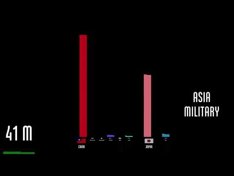
Neil Halloran's animated, data-driven documentary visualizes the human cost of World War II and compares it with other wars and the trend toward fewer war deaths in recent decades.
 8:19
Code Bubbles: Rethinking the User Interface Paradigm of Integrated Development Environments
284K views • 16 years ago
AndrewBragdon
A short demo of Code Bubbles, an IDE interface built around editable code fragments in bubbles instead of files. It was a research prototype for Java development.
 10:16
Hans Rosling: Global population growth, box by box
1.9M views • 16 years ago
TED
Hans Rosling's TED@Cannes talk uses boxes and animated data graphics to show how world population will grow to about 9 billion. He argues that raising living standards for the poorest is what reduces population growth.
 6:55
Quick-sort with Hungarian (Küküllőmenti legényes) folk dance
2.4M views • 15 years ago
AlgoRythmics
Hungarian folk dancers from Sapientia University act out the quicksort algorithm step by step, with music. It is part of the AlgoRythmics series of sorting algorithms performed as dance.
 11:57
We all move at the Speed of Light
1.4M views • 8 years ago
ScienceClic English
ScienceClic explains why nothing can go faster than light by treating motion through space and time together, so everything moves at the speed of light through spacetime. It uses animated visuals to cover relativity basics in 12 minutes.
 5:53
CYMATICS: Science Vs. Music - Nigel Stanford
54.8M views • 11 years ago
Nigel John Stanford
Nigel Stanford's music video Cymatics, in which real science experiments, such as Chladni plates, ferrofluid and water, visualize the audio.
 5:11
Asteroid Discovery - 1970-2015 - 8K resolution
298K views • 11 years ago
Scott Manley
Scott Manley's short animation shows every asteroid discovery from 1970 to 2015 plotted over time in 8K. It makes visible how survey technology made discoveries accelerate and where telescopes looked.
 4:58
Most Popular Programming Languages 1965 - 2019
7.2M views • 7 years ago
Data Is Beautiful
An animated ranking of the most popular programming languages from 1965 to 2019, built from popularity indexes, GitHub access data and historical surveys.
 12:11
Non-euclidean virtual reality
982K views • 9 years ago
Henry Segerman
Henry Segerman and collaborators demonstrate virtual reality experiences in non-Euclidean spaces, including hyperbolic and mixed hyperbolic-Euclidean geometry. The browser-based demos let viewers move through these spaces and show how strange the geometry feels from inside.
 9:01
Powers of Ten™ (1977)
9.5M views • 16 years ago
Eames Office
The Eames Office's 1977 film Powers of Ten starts at a picnic in Chicago and zooms out by a factor of ten every ten seconds to the edge of the universe. It then zooms inward to a proton in a carbon atom.
 6:47
Starlink revisions, Nov 2018
173K views • 8 years ago
Mark Handley
Mark Handley of UCL looks at how SpaceX's November 2018 revisions to the Starlink constellation affect network behavior. The video visualizes the orbits and routing and estimates latencies, building on his earlier video and research paper.
 12:44
Rapping, deconstructed: The best rhymers of all time
16.3M views • 10 years ago
Vox
Vox breaks down how great rappers build rhymes, from Kurtis Blow's simple bars to Biggie's smooth flow and Kendrick Lamar's dense, fast delivery. It uses on-screen visualizations of rhyme structure.
 7:55
Low Latency Routing in Space
106K views • 8 years ago
HotNets Anonymous
A short visualization from HotNets researchers of routing and latency over SpaceX's proposed Starlink constellation, based on its FCC filings. It shows orbital shells, link topology and how inter-satellite routes could beat terrestrial fiber on long distances.
 10:15
Using ground relays with Starlink
506K views • 6 years ago
Mark Handley
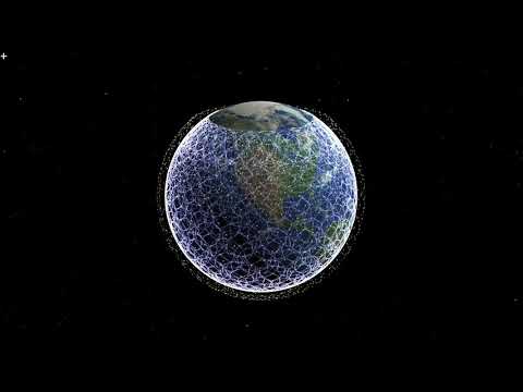
Mark Handley of UCL explains, with simulation visualizations, how early Starlink satellites without inter-satellite links could still give low-latency wide-area communication by hopping via ground relays. He shows it can beat fibre on many long paths.
 12:09
How I Fixed a 10 Year Old Guitar Hero Bug Without the Source Code
404K views • 9 years ago
ExileLord
A reverse engineer walks through fixing a ten-year-old bug in Guitar Hero III without access to its source code, using a disassembler and decompiler. It is technical but explained step by step.
 13:38
Why Japan had NO Chance in WW2
835K views • 7 years ago
Military History Visualized
Military History Visualized charts ship production by the United States and Japan from December 1941 to September 1945. The growing numbers show why Japan, despite a stronger starting navy, could not win a long war.
 11:39
The Unbeatable Game from the 60s: Dr NIM
7.2M views • 10 years ago
Stand-up Maths
Matt Parker of Stand-up Maths explains single-pile Nim and the trick that wins it, using Dr NIM, a 1960s mechanical plastic computer that plays perfectly. He teaches the strategy so viewers can beat friends.
 6:40
High Res Wifi Signal Mapping
551K views • 11 years ago
CNLohr
CNLohr maps Wi-Fi signal strength at high resolution by moving an ESP8266 on a CNC mill, then visualizes the 3D data in WebGL. The result shows interference patterns in space.
 6:54
NASA | Earthrise: The 45th Anniversary
2.3M views • 12 years ago
NASA Goddard
NASA Goddard recreates the Apollo 8 Earthrise moment using Lunar Reconnaissance Orbiter data, narrated by Andrew Chaikin and synced with the astronauts' recorded conversation. It marks the flight's 45th anniversary.
 5:13
Overview of Illumina Sequencing by Synthesis Workflow | Standard SBS chemistry
2.7M views • 10 years ago
Illumina
Illumina's 3D animation of its sequencing-by-synthesis workflow, from sample preparation and cluster generation to sequencing on a flow cell and data analysis.