interface design
 1:06:59
Music Software & Interface Design: Steinberg's Dorico
949K views • 6 years ago
Tantacrul
Tantacrul critiques the UX and UI of Steinberg's Dorico music notation software, comparing it with Sibelius and user testing it with real musicians alongside his own attempt to compose in it.
 33:39
Music Software & Interface Design: MuseScore
959K views • 7 years ago
Tantacrul
Tantacrul gives a detailed UX and UI design review of the MuseScore 3 notation software and compares it with Sibelius. It examines visual appeal, navigation and notation quality.
 21:35
Music Software & Bad Interface Design: Avid’s Sibelius
1.7M views • 7 years ago
Tantacrul
Tantacrul dissects the UX and UI of Avid's Sibelius music notation software, going through a long list of bad design choices. The review is both a comic rant and a practical lesson in interface design.
 1:03:14
Category Theory, The essence of interface-based design - Erik Meijer
74K views • 11 years ago
FooCafe
Erik Meijer argues that category theory is the mathematicians' version of interface-based design. He shows that Java 8 lambdas and method references form a Cartesian closed category.
 27:36
Why Western Designs Fail in Developing Countries
1.8M views • 2 years ago
Design Theory
A design essay on why products designed in Western contexts often fail when deployed in developing countries. It covers expert blindness and cultural assumptions, with examples such as malaria nets and the One Laptop Per Child project.
 46:33
How We Made MuseScore 4 - Music App Design is Challenging!
814K views • 3 years ago
Tantacrul
Tantacrul walks through how the MuseScore 4 team was built and how design decisions were made for the overhaul of a huge legacy notation app. It covers playback and engraving quality improvements.
 5:51
Susan Kare explains Macintosh UI ergonomics on the Computer Chronicles (1984)
51K views • 6 years ago
erg0steur
A 1984 Computer Chronicles segment in which Susan Kare explains the ergonomics and interface design of the original Macintosh. She introduces the interface step by step for newcomers.
Topic match · UX & UI design 1:04:47
Don't Make Me Click
73K views • 18 years ago
Google TechTalks
A Google Tech Talk arguing that the best interface requires the fewest clicks and choices, with Google search, Facebook, the iPod and Firefox as examples. It shows how minimizing interaction makes interfaces easier to learn.
Topic match · UX & UI design 0:49
Material design
4.5M views • 12 years ago
Google for Developers
Google's 2014 reel introducing Material Design, a visual language based on a paper-and-ink material metaphor and a system of motion. It is a short promotional video.
 1:00:19
How To Design A Good API and Why it Matters
453K views • 19 years ago
Google TechTalks
Joshua Bloch's Google Tech Talk on how to design good APIs and why it matters, with concrete principles and examples. It treats every programmer as an occasional API designer.
 4:23
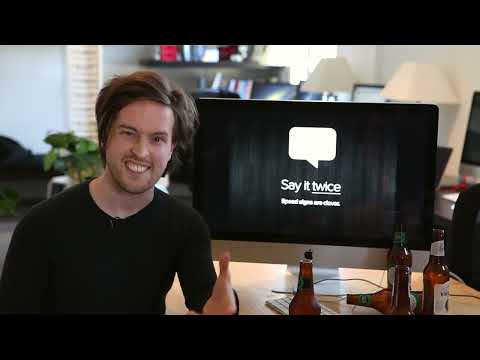
The User is Drunk
275K views • 13 years ago
squareweave
A short talk by Will Dayble of Squareweave arguing that you should design software as if the user were drunk: distracted, impaired in attention and vision, and prone to misreading. It is a user experience talk built around that framing.
Topic match · UX & UI design 1:30:32
MIX08 Microsoft Office 2007: The Story of the Ribbon
3K views • 10 years ago
zoobean
A MIX08 session from Microsoft's Office team on how the Office 2007 ribbon was designed. It explains the user-feedback and telemetry behind it and the alternatives that were rejected.
Topic match · UX & UI design 48:39
Andrew Price - Improving Blender's UI
62K views • 13 years ago
Blender
Andrew Price presents at the Blender conference on the problems, politics and possible fixes for Blender's user interface, followed by a full Q&A. He argues that an interface upgrade is overdue.
Topic match · UX & UI design 3:13
interactive ui in minority report
520K views • 18 years ago
ysnimkim
A short compilation of the gesture and multitouch interface scenes from the film Minority Report.
Topic match · UX & UI design 15:15
why Japan's internet is weirdly designed
5.2M views • 3 years ago
Answer in Progress
Answer in Progress investigates why Japanese websites look different from those elsewhere, using an AI clustering approach to test the 2013 claim. It then looks at possible explanations.
 1:57:00
Origins of the Apple Human Interface
13K views • 7 years ago
Computer History Museum
A 1997 Computer History Museum lecture in which Larry Tesler and Chris Espinosa recount how the Apple human interface was born, from the Lisa through the Macintosh. It covers design decisions such as discoverability and the standard editing keys.
 17:10
Xerox Star User Interface: An overview
20K views • 5 years ago
ACM SIGCHI
A 1982 Xerox PARC film, presented at CHI '90, in which Star designers David Canfield Smith and Charles Irby give an overview of the Xerox Star interface. It shows the document-centric, icon-and-window office system.
 3:18
A New Car UI: How touch screen controls in cars should work
473K views • 12 years ago
Matthaeus Krenn
Matthaeus Krenn presents a concept for car touchscreen UI where the screen controls only one thing at a time, designed to suit driving. A tablet prototype accompanies the short demo.
Topic match · UX & UI design 10:01
MIX08 Microsoft Office 2007: The Story of the Ribbon (1 of 10)
32K views • 17 years ago
creativecrewchannel
Jensen Harris of the Office 2007 design team tells the behind-the-scenes story of the Ribbon at MIX08. He covers early prototypes, mistakes, and the UX principles used to design and validate it.
Topic match · UX & UI design 19:55
New Blender UI - The Proposal
202K views • 13 years ago
Blender Guru
Blender Guru's Andrew Price proposes a redesign of Blender's user interface, answering the usability problems raised in earlier parts of the series. He later noted the proposal had flaws and posted a follow-up.
Topic match · UX & UI design 1:01:40
A Philosophy of Software Design | John Ousterhout | Talks at Google
547K views • 8 years ago
Talks at Google
John Ousterhout, Stanford professor and creator of Tcl, presents the ideas of his book A Philosophy of Software Design in a Talks at Google session. He covers managing complexity, deep modules and interfaces, and what he teaches in his Stanford software design course.
 36:42
Bottom Up vs Top Down Design in Clojure - Mark Bastian
29K views • 10 years ago
ClojureTV
Mark Bastian contrasts top-down object-oriented design with bottom-up, data-oriented design in Clojure. He models a board game as plain data plus small composable functions and compares it with a roughly 22-class OOP version.
 58:23
Evan Czaplicki - Let's be mainstream! User focused design in Elm - Curry On
82K views • 11 years ago
Curry On!
Evan Czaplicki, creator of Elm, talks at Curry On 2015 about user-focused language design. He explains the principles behind Elm and how to make a functional, typed language as approachable as JavaScript.
 37:15
Stuart Halloway - Narcissistic Design
29K views • 9 years ago
Reaktor
Stuart Halloway's satirical talk describes how to protect yourself from industry change by spreading complexity through systems while following idiomatic practice. It uses this inversion to catalog software design anti-patterns.
 27:00
AT&T Archives: Saul Bass Pitch Video for Bell System Logo Redesign
417K views • 14 years ago
AT&T Tech Channel
The 1969 pitch film in which Saul Bass presents the Bell System logo redesign to AT&T, part of the largest corporate re-identity program in U.S. history.
 25:21
5 steps to designing the life you want | Bill Burnett | TEDxStanford
11.4M views • 9 years ago
TEDx Talks
TEDxStanford talk by Bill Burnett, executive director of Stanford's design program, on applying design thinking to your own life and career. He offers five practical tips such as getting curious, talking to people and trying things.
 58:24
#Gamelab2018 - Jon Blow's Design decisions on creating Jai a new language for game programmers
210K views • 8 years ago
Gamelab Conference
Jonathan Blow talks at Gamelab 2018 about the design decisions behind Jai, the programming language he is building for game programmers. He covers low-friction development, quality of life and the effects of compile times.
 44:03
Google Developers Day US - Python Design Patterns
90K views • 19 years ago
GoogleDeveloperDay
Alex Martelli's Google Developers Day talk on classic design patterns (creational, structural and behavioral) and how they appear in Python. He stresses that patterns must be studied in the context of the implementing language.
 1:40:06
KiCad 6 STM32 PCB Design Full Tutorial - Phil's Lab #65
987K views • 4 years ago
Phil’s Lab
A 100-minute tutorial from Phil's Lab on designing an STM32-based 'black pill' PCB in KiCad 6. It covers schematic capture, two-layer layout and routing, USB, and sending the board for manufacture and assembly.
 18:19
Why city flags may be the worst-designed thing you've never noticed | Roman Mars
5.2M views • 11 years ago
TED
Roman Mars gives a funny TED talk on vexillology, laying out five basic principles of good flag design and why many city flags fail them.
 1:00:06
Computer Science - Brian Kernighan on successful language design
332K views • 10 years ago
University of Nottingham
Brian Kernighan gives a talk at the University of Nottingham on how to succeed in language design without really trying. He draws on his experience with awk and other languages.
 1:58:46
Dynamic Languages Wizards Series - Panel on Language Design
16K views • 14 years ago
Eduardo Cavazos
A 2001 panel with Paul Graham, John Maeda, Jonathan Rees and Guy Steele on programming language design, part of the Dynamic Languages Wizards Series.
 23:23
Building Prototypes Dan Gelbart part 18 of 18 Design
99K views • 13 years ago
Dan Gelbart
The final part of Dan Gelbart's 18-part Building Prototypes series, focused on mechanical design. It opens with a demonstration of stiffness and covers practical design principles for prototype machines.
 11:02
How to design an actually good toaster with lessons from the 1940's
851K views • 6 years ago
Technology Connections
Technology Connections praises a 1940s-50s Sunbeam toaster and explains what makes a toaster well designed, drawing on a vintage Sunbeam video.
 18:53
There's No Crying in Flag Design
20.6M views • 3 years ago
CGP Grey
CGP Grey discusses flag design principles and grades flags, following the Minnesota state flag redesign. It argues for simple, distinctive flags.
 28:10
CANDO: A Compiled Programming Language for Computer-Aided Nanomaterial Design and Optimization
3K views • 10 years ago
European Lisp Symposium
Christian Schafmeister presents CANDO at the 2016 European Lisp Symposium. It is a compiled Lisp-based language for designing macromolecules and nanoscale materials, built on the Clasp implementation of Common Lisp.
 36:30
Pricing Design Work & Creativity (The Guide)
4.6M views • 10 years ago
The Futur
The Futur's guide to pricing design and creative work, arguing against hourly rates and for value-based pricing. It features Blair Enns and says to price the client, not the job.
 12:13
My Squirrel Recording is in a MOVIE! 📽 DUNE: Mark Mangini, Oscar Winning Sound Designer
60K views • 5 years ago
Dani Connor Wild
Wildlife videographer Dani Connor Wild talks with Oscar-winning sound designer Mark Mangini about how her red squirrel recording became the desert mouse sound in Dune.
 4:25
Redesign Your Logo (2010 live backing video)
526K views • 5 years ago
NeilCicieregaMusic
Neil Cicierega's parody song 'Redesign Your Logo', played over a live backing video with corporate PowerPoint visuals. It mocks the infamous Pepsi design strategy presentation.
 1:24
2Advanced Studios v2 flash website in 2001
29K views • 7 years ago
Web Design Museum
A one-minute archive video of the 2Advanced Studios v2 website from 2001, a showcase of the elaborate futuristic Flash interfaces the agency was known for.
Topic match · UX & UI design