unicode
 36:21
Pragmatic Unicode, or, How do I stop the pain?
80K views • 14 years ago
Next Day Video
Ned Batchelder's PyCon 2012 talk gives a quick overview of what Unicode is, then focuses on what a Python programmer needs to handle text correctly. It presents the 'Unicode sandwich' strategy: decode bytes at input, work with Unicode internally, encode at output.
 9:37
Characters, Symbols and the Unicode Miracle - Computerphile
2.1M views • 13 years ago
Computerphile
Tom Scott explains for Computerphile how Unicode and UTF-8 grew out of messy older character encodings to become the web's standard. It covers why the design works and how it handles worldwide text.
 59:20
Plain Text - Dylan Beattie - NDC Copenhagen 2022
194K views • 4 years ago
NDC Conferences
Dylan Beattie's conference talk explores the history and mess behind plain text: encodings, Unicode, line endings and the many ways text goes wrong. It argues that the tidy idea of plain text hides a lot of complexity underneath everyday software.
Topic match · Graphic design & typography 29:51
Refterm v2 - Resource usage, binary splat, glyph sizing, and more
68K views • 5 years ago
Molly Rocket
Casey Muratori follows up his refterm proof-of-concept, a GPU-based terminal renderer, with a second part covering memory usage, glyph sizing and correct Unicode and VT handling. It is built to show that a terminal can be fast and correct without heroic effort.
Topic match · Graphic design & typography 2:13
Real Life Emoji Keyboard!
735K views • 11 years ago
Tom Scott
Tom Scott shows a full-size real-life emoji keyboard built from 14 keyboards and over 1,000 hand-placed stickers, covering all of Unicode 8.
Topic match · Graphic design & typography 47:25
Introducing SILE: A New Typesetting System
5K views • 11 years ago
lathosjp
The SILE author's FOSDEM 2015 talk introducing SILE, a TeX-inspired typesetting system with frame-based layout, Unicode, OpenType and a Lua-based extensible design.
Topic match · Graphic design & typography 2:13:35
Let's build the GPT Tokenizer
1.3M views • 2 years ago
Andrej Karpathy
Andrej Karpathy builds the GPT tokenizer from scratch, implementing byte pair encoding along with encode and decode. He shows how many odd LLM behaviors trace back to tokenization, and covers Unicode byte encodings along the way.
 21:15
Brown; color is weird
5.3M views • 6 years ago
Technology Connections
Technology Connections explains why brown is not a spectral color but a context-dependent perception, essentially dark orange seen against brighter surroundings.
Topic match · Graphic design & typography 6:34
Stephen Fry Kinetic Typography - Language
3M views • 16 years ago
Built By Matt
A kinetic typography animation set to Stephen Fry's spoken essay on language. Fry argues against grammar pedantry and for the way language evolves, including the verbing of nouns.
Topic match · Graphic design & typography 28:46
FarewellEtaoinShrdlu
259K views • 10 years ago
Drinks and Dice
A documentary on the last day the New York Times was printed with linotype machines in 1978, following the process from the newsroom to the press. It marks the move to computerized typesetting.
Topic match · Graphic design & typography 19:40
How I Designed a Free Music Font for 5 Million Musicians (MuseScore 3.6)
608K views • 5 years ago
Tantacrul
Tantacrul explains how he and engraver Simon Smith designed the free music notation font for MuseScore 3.6. It draws on the history of the SCORE notation application by Leland Smith.
Topic match · Graphic design & typography 15:09
Mouse Cursor History (and why I made my own)
3M views • 8 years ago
Posy
Posy gives a short history of the computer mouse cursor, from early straight pointers to the tilted arrow, comparing Apple and Windows designs. He then explains why he designed his own cursor set and offers it as a free download.
Topic match · Graphic design & typography 4:14
Computer Color is Broken
4.3M views • 11 years ago
minutephysics
MinutePhysics explains that computers store brightness nonlinearly, so blurring and blending colors in raw RGB gives wrong, dark results. It shows why mixed colors, such as in gradients, look off.
Topic match · Graphic design & typography 24:13
Uppestcase and Lowestcase Letters [advances in derp learning]
477K views • 5 years ago
suckerpinch
Tom Scott-style absurdist research by tom7 for SIGBOVIK 2021, using machine learning to discover letterforms that are 'uppercaser' than uppercase A and lowercaser than lowercase. It is a comedic, technically inventive deep dive with fonts and a paper.
Topic match · Graphic design & typography 3:41
A quick tour of TeXmacs
32K views • 5 years ago
TeXmacs Videos
A four-minute tour of the TeXmacs scientific editor, showing math typing, figures, citations, a drawing tool, document styles, HTML export, presentations and animations.
Topic match · Graphic design & typography 2:56
Microsoft Re-Designs the iPod Packaging
1.3M views • 20 years ago
Brant Walsh
A 2006 parody made by a Microsoft team that shows how the company would redesign iPod packaging, with a box piled with feature claims, logos and clutter in contrast to Apple's clean design.
Topic match · Graphic design & typography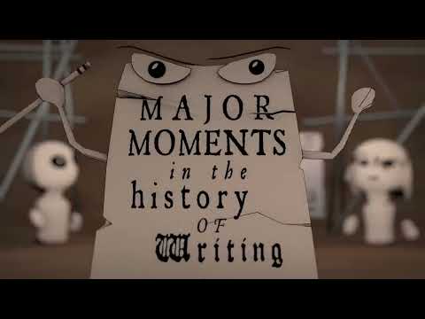 47:25
Thoth's Pill - an Animated History of Writing
1.3M views • 11 years ago
NativLang
NativLang's 47-minute animated documentary traces the birth and evolution of writing, from early cave marks to modern scripts. It presents the history of the world's writing systems as a story.
Topic match · Graphic design & typography 13:55
Segmented Displays
7.2M views • 4 years ago
Posy
Posy explores segmented displays, from the seven-segment display to alternative designs with fewer or more segments, with patents and history.
Topic match · Graphic design & typography 27:00
AT&T Archives: Saul Bass Pitch Video for Bell System Logo Redesign
417K views • 14 years ago
AT&T Tech Channel
The 1969 pitch film in which Saul Bass presents the Bell System logo redesign to AT&T, part of the largest corporate re-identity program in U.S. history.
Topic match · Graphic design & typography 5:13
WordTeX - A WYSIPCTWOTCG Typesetting Tool
403K views • 8 years ago
Tom Wildenhain
Tom Wildenhain's SIGBOVIK 2018 presentation of WordTeX, a Microsoft Word template that mimics LaTeX typesetting output. It is a joke research project executed with serious effort.
Topic match · Graphic design & typography 22:15
Badness 0 (Apostrophe‛s version)
258K views • 2 years ago
suckerpinch
Tom 7's pilot episode of a series that plays with type systems and absurd programming, presented as a parody of the GPL v3 license. It mixes a typesetting experiment with a long, story-driven intro on the origin of TeX. Source code and papers are linked from the author's site.
Topic match · Graphic design & typography 18:28
w
3.7M views • 7 years ago
jan Misali
jan Misali traces the history of the letter W, including why it is called double u. The video is part of a series of deep dives into individual letters.
Topic match · Graphic design & typography 18:19
Why city flags may be the worst-designed thing you've never noticed | Roman Mars
5.2M views • 11 years ago
TED
Roman Mars gives a funny TED talk on vexillology, laying out five basic principles of good flag design and why many city flags fail them.
Topic match · Graphic design & typography 22:10
Steve Jobs Stanford Commencement Speech 2005 high definition.flv
675K views • 14 years ago
Jed Joe
Steve Jobs's 2005 Stanford commencement address, in which he tells three stories about connecting the dots, love and loss, and death, including his remarks on typography.
Topic match · Graphic design & typography 7:31
1993 interview re: Paul Rand and Steve Jobs
480K views • 19 years ago
youareworthy
A 1993 interview in which Steve Jobs talks about designer Paul Rand, who created the NeXT logo. He recounts Rand's insistence on presenting a single design and his uncompromising professionalism.
Topic match · Graphic design & typography 19:55
The Great 202 Jailbreak - Computerphile
532K views • 12 years ago
Computerphile
Computerphile with Professor Brailsford on how a 1979 Bell Labs team reverse engineered a Linotron 202 phototypesetter over a summer to get high-quality print output. It covers typesetting history and the later 2013 rebuild of the famous vacation memo.
Topic match · Graphic design & typography 3:26
Shop Vac (kinetic typography animation)
1.7M views • 15 years ago
jmheather
A kinetic typography animation for Jonathan Coulton's song 'Shop Vac', made by Jarrett Heather with Illustrator, After Effects and other tools over 500-1000 hours.
Topic match · Graphic design & typography 18:53
There's No Crying in Flag Design
20.6M views • 3 years ago
CGP Grey
CGP Grey discusses flag design principles and grades flags, following the Minnesota state flag redesign. It argues for simple, distinctive flags.
Topic match · Graphic design & typography 42:25
Glenn Vanderburg - Cló: The Algorithms of TeX in Clojure
9K views • 11 years ago
ClojureTV
Glenn Vanderburg presents Cló, a Clojure library that reimplements TeX's core typesetting algorithms as composable functions. He shows what translating procedural, literate-programming code into functional form teaches.
Topic match · Graphic design & typography 3:46
"Weird Al" Yankovic - Word Crimes (Official 4K Video)
66.6M views • 12 years ago
alyankovicVEVO
Weird Al Yankovic's 2014 parody of 'Blurred Lines' that scolds common grammar and usage errors, with a kinetic typography video. It is a catchy music video about language mistakes.
Topic match · Graphic design & typography 36:30
Pricing Design Work & Creativity (The Guide)
4.6M views • 10 years ago
The Futur
The Futur's guide to pricing design and creative work, arguing against hourly rates and for value-based pricing. It features Blair Enns and says to price the client, not the job.
Topic match · Graphic design & typography 12:23
Typesetters in the '80s - Computerphile
105K views • 12 years ago
Computerphile
Professor Brailsford of the University of Nottingham describes how the university set out to print its own mathematics exam papers in the 1980s. The story centers on getting a Mergenthaler Linotron 202 typesetter to work with their own software.
Topic match · Graphic design & typography 4:25
Redesign Your Logo (2010 live backing video)
526K views • 5 years ago
NeilCicieregaMusic
Neil Cicierega's parody song 'Redesign Your Logo', played over a live backing video with corporate PowerPoint visuals. It mocks the infamous Pepsi design strategy presentation.
Topic match · Graphic design & typography 22:19
The Weird World in RGB
2.7M views • 7 years ago
Technology Connections
Technology Connections explains how RGB light and color work, from hue and saturation to color vision and how objects appear under different lighting. It uses a studio setup with colored lights to demonstrate the effects.
Topic match · Graphic design & typography 2:28
Lies on the London Underground
4.6M views • 13 years ago
Tom Scott
Tom Scott and Matt Parker investigate some of the small deceptions and oddities of the London Underground, such as misleading signage and map distortions.
Topic match · Graphic design & typography 3:52
I can't show you how pink this pink is.
9.7M views • 9 years ago
Tom Scott
Tom Scott explains why a vivid pink pigment by artist Stuart Semple cannot be fully shown on a screen, and touches on the dispute over exclusive rights to the blackest black pigment. It is a short explainer on color gamuts and pigment politics.
Topic match · Graphic design & typography 3:00
American Psycho -Business Card Scene
21.6M views • 17 years ago
Alex Curro
The business card scene from the film American Psycho, in which characters compare their business cards.
Topic match · Graphic design & typography 11:24
The Tube Map nearly looked very different
2.6M views • 4 years ago
Map Men
Map Men's Jay Foreman tells the story of how the London Tube map nearly looked very different, including Harry Beck's design and TfL's initial rejection of it. A short, witty history of a design icon.
Topic match · Graphic design & typography 3:06
Papyrus - SNL
25.8M views • 9 years ago
Saturday Night Live
An SNL sketch in which Ryan Gosling's character is obsessed with the font choice (Papyrus) in the movie Avatar's title. It is a comedy bit about a widely mocked typeface.
Topic match · Graphic design & typography 51:04
[EPILEPSY WARNING] How fast should an unoptimized terminal run?
193K views • 5 years ago
Molly Rocket
Casey Muratori shows how fast a terminal renderer can run, building a simple reference renderer that handles Unicode and colored text far quicker than Windows Terminal. He argues that common excuses for slow terminals do not hold up.