data visualization
 6:08
Immigration, World Poverty and Gumballs
6.8M views • 16 years ago
NumbersUSA
Roy Beck's short gumball presentation using World Bank and Census data to argue that letting people immigrate to the US cannot solve world poverty because the numbers are so large. It is made by NumbersUSA, an immigration-restriction advocacy group.
Topic match · Data visualization & information design 4:48
Hans Rosling's 200 Countries, 200 Years, 4 Minutes - The Joy of Stats - BBC
11.5M views • 15 years ago
BBC
Hans Rosling uses augmented-reality animation to show 200 countries over 200 years in four minutes, built from 120,000 data points. It tracks life expectancy and income to show the world's development.
Topic match · Data visualization & information design 14:32
Orbital Data Centers Yes or No
18K views • 1 year ago
Eager Space
Eager Space examines the practicality of putting data centers in orbit, walking through three scenarios with cost calculations and the launch cost reductions that would be required.
 16:37
Does It Make Sense To Put Data Centers In Space? Can They Really Cost Less To Operate?
502K views • 2 years ago
Scott Manley
Scott Manley analyzes the idea of putting data centers in orbit, prompted by Lumen Orbit's funding. He examines the claimed advantage of constant solar power against launch cost, cooling and mass.
 6:40
Overpopulation – The Human Explosion Explained
14M views • 9 years ago
Kurzgesagt – In a Nutshell
A Kurzgesagt explainer on why the human population exploded and why growth is slowing, drawing on Our World in Data. It argues that birth rates fall as countries develop, easing overpopulation fears.
Topic match · Data visualization & information design 12:20
I Solved Klotski
2.1M views • 1 year ago
2swap
2swap explains how he solved the Klotski sliding-block puzzle by mapping its full state space as a graph and visualizing it. The video includes footage of the Guinness world-record solve and links to an interactive graph.
Topic match · Data visualization & information design 6:51
Star Size Comparison 2
48.7M views • 10 years ago
morn1415
A visual scale comparison of stars and cosmic objects, from planets up to some of the largest known stars, set to music. It is meant to convey the vastness of the universe.
Topic match · Data visualization & information design 4:17
The Hubble Ultra Deep Field in 3D
9.6M views • 17 years ago
Deep Astronomy
A short video built around an animation of the roughly 10,000 galaxies in the Hubble Ultra Deep Field, placed at their measured redshift distances. It gives a brief history of deep field images and ends with a 3D fly-through.
Topic match · Data visualization & information design 6:24
Wealth Inequality in America
26.7M views • 13 years ago
politizane
A short infographic video on the distribution of wealth in America, contrasting what people believe, what they consider ideal, and the actual numbers. It highlights how top-heavy US wealth is.
Topic match · Data visualization & information design 11:33
A new way to visualize General Relativity
3.6M views • 6 years ago
ScienceClic English
ScienceClic explains why the rubber sheet analogy for general relativity is misleading and offers a new visualization that includes the curvature of time and shows gravity as motion through curved spacetime.
 14:34
Visualization of Quantum Physics (Quantum Mechanics)
2.8M views • 9 years ago
udiprod
An animated visualization of basic quantum mechanics using a free particle, with simulations based on the actual equations. It covers waves, particles, and how measurement collapses the wavefunction.
 6:18
Animated Voting Methods
16K views • 9 years ago
Unify The Vote
An animated simulation comparing single-winner voting methods such as plurality, instant runoff and STAR. Colored regions show which candidate wins as a randomized electorate shifts across a two-dimensional political space, building on Ka-Ping Yee's earlier diagrams.
Topic match · Data visualization & information design 8:33
Drawing Conclusions: Is renting really a waste of money?
5.4M views • 11 years ago
The Globe and Mail
A short Globe and Mail animated explainer on why renting can leave you as well off as buying a home. It walks through a rent-versus-buy comparison using Toronto numbers and the opportunity cost of a down payment. The video notes it dates from 2015 and the housing market has changed since.
Topic match · Data visualization & information design 12:32
Protecting Privacy with MATH (Collab with the Census)
451K views • 7 years ago
minutephysics
minutephysics, in collaboration with the US Census Bureau, explains differential privacy and why the 2020 census adds noise to protect individuals' data. It walks through how statistics can leak private information.
 8:09
Google Earth’s Incredible 3D Imagery, Explained
3.1M views • 9 years ago
Nat and Friends
A short explainer from Nat and Friends on where Google Earth's 3D imagery comes from, how it is stitched together, and how often it is updated. It describes aircraft carrying camera rigs and photogrammetry that turns the photos into 3D models.
Topic match · Data visualization & information design 19:42
Using AI To Detect AI Music (and other music industry data-porn)
452K views • 1 year ago
Benn Jordan
Musician Benn Jordan uses AI to detect AI-generated music and digs into music industry data, including streaming payouts and sample library copyright problems. He covers ways to tell whether a track is human-made.
 11:45
The History of Europe: Every Year
33.9M views • 8 years ago
Cottereau
An animated map showing the borders and populations of European countries for every year since 400 BC. Vassal states and colonies are excluded from population counts.
Topic match · Data visualization & information design 11:24
The Tube Map nearly looked very different
2.6M views • 4 years ago
Map Men
Map Men's Jay Foreman tells the story of how the London Tube map nearly looked very different, including Harry Beck's design and TfL's initial rejection of it. A short, witty history of a design icon.
Topic match · Data visualization & information design 10:36
Who Is Responsible For Climate Change? – Who Needs To Fix It?
11.7M views • 6 years ago
Kurzgesagt – In a Nutshell
Kurzgesagt examines who is responsible for climate change, comparing historical, current and per-capita emissions by country. It argues that individual footprints are a distraction from larger responsibility.
 15:53
Quantum Field Theory visualized
2.7M views • 6 years ago
ScienceClic English
ScienceClic gives a 15-minute animated introduction to quantum field theory, covering fields, spin, conserved quantities, the standard model and interactions.
 17:46
Why do Biden's votes not follow Benford's Law?
3.7M views • 5 years ago
Stand-up Maths
Matt Parker examines claims that Biden's 2020 vote counts violate Benford's Law, explaining the law and why it often does not apply to precinct-level election data.
 18:40
But what is a neural network? | Deep learning chapter 1
25.1M views • 9 years ago
3Blue1Brown
3Blue1Brown's first chapter on deep learning explains what neurons and layers are and the math underlying a basic neural network, using handwritten digit recognition with visual animations.
 18:18
Hilbert's Curve: Is infinite math useful?
2.4M views • 9 years ago
3Blue1Brown
3Blue1Brown explains space-filling curves and the Hilbert curve, and how infinite mathematical constructions connect to finite, practical approximations. It touches on mapping between dimensions and sensory ideas.
 4:08
e^(iπ) in 3.14 minutes, using dynamics | DE5
3.4M views • 7 years ago
3Blue1Brown
A short 3Blue1Brown video explaining Euler's formula e^(i*pi) = -1 through dynamics, treating velocity as the thing that moves a point to a new position. It builds geometric intuition for why an exponent with i produces rotation.
 4:01
Spherical Geometry Is Stranger Than Hyperbolic - Hyperbolica Devlog #2
1.8M views • 6 years ago
CodeParade
CodeParade's short devlog on how spherical geometry looks in 2D and 3D and why it feels so unusual, part of the Hyperbolica series on a non-Euclidean game.
 11:57
We all move at the Speed of Light
1.4M views • 7 years ago
ScienceClic English
ScienceClic explains why nothing can go faster than light by treating motion through space and time together, so everything moves at the speed of light through spacetime. It uses animated visuals to cover relativity basics in 12 minutes.
 14:53
What would we see if we fell into a Black Hole?
7.5M views • 5 years ago
ScienceClic English
ScienceClic visualizes what you would see falling into a black hole, from the approach and the accretion disc to crossing the horizon, in 15 minutes.
 5:13
Overview of Illumina Sequencing by Synthesis Workflow | Standard SBS chemistry
2.7M views • 10 years ago
Illumina
Illumina's 3D animation of its sequencing-by-synthesis workflow, from sample preparation and cluster generation to sequencing on a flow cell and data analysis.
 14:03
The Computer Designed To Die In Microseconds
408K views • 3 years ago
Scott Manley
Scott Manley tells the story of a computerized telemetry system built to sit at the heart of a nuclear test device in place of the plutonium pit, designed to transmit data in the microseconds before it was destroyed.
 7:49
America Keeps Rejecting an ID Card It Already Has
13.6M views • 9 years ago
CGP Grey
CGP Grey explains the history of the US Social Security card and number, and why they became a de facto national ID despite never being meant for it. He also covers why America resists a proper identity card.
 8:21
The Grille Trend that Kills 509 People per Year
1.3M views • 2 years ago
FortNine
FortNine looks at the data on why newer pickup trucks with tall, blunt grilles kill so many pedestrians, cyclists and motorcyclists. It argues that lowering hood height would substantially cut fatalities.
 7:49
Your Post Code Is the Directions, Not the Destination
3.9M views • 1 year ago
CGP Grey
CGP Grey explains that postal codes are routing instructions for mail rather than geographic regions. He looks at the quirks and problems this causes.
 6:43
Explained: "Go Fast" UFO Video - Not Low and Not Fast - Like a Balloon!
156K views • 7 years ago
Mick West
Mick West analyzes the Navy "Go Fast" UFO footage and shows with simple trigonometry and the data overlay that the object is slow and high up, consistent with a balloon. He explains how parallax makes it look fast and argues the original TV claims were wrong.
 6:47
Starlink revisions, Nov 2018
173K views • 7 years ago
Mark Handley
Mark Handley of UCL looks at how SpaceX's November 2018 revisions to the Starlink constellation affect network behavior. The video visualizes the orbits and routing and estimates latencies, building on his earlier video and research paper.
 12:44
Rapping, deconstructed: The best rhymers of all time
16.3M views • 10 years ago
Vox
Vox breaks down how great rappers build rhymes, from Kurtis Blow's simple bars to Biggie's smooth flow and Kendrick Lamar's dense, fast delivery. It uses on-screen visualizations of rhyme structure.
 17:51
Does "land area" assume a country is perfectly flat?
859K views • 6 years ago
Stand-up Maths
Matt Parker of Stand-up Maths asks whether a country's reported land area accounts for hills and mountains, working through how surface area depends on the resolution of elevation data. It follows up on a question from a viewer and work by researchers who measured it.
 11:33
Light Waves Visualized using Photon Sieves.
69K views • 6 years ago
Huygens Optics
Huygens Optics shows how DIY photon sieves shape a laser's wave front, explaining how they differ from zone plates and how aperture count affects the focal point, with time-resolved visualizations of the diffraction.
 14:21
The Antique Microwave Oven that's Better than Yours
2.7M views • 5 years ago
Technology Connections
Technology Connections examines an old feature-rich microwave and shows how it uses a humidity or steam sensor and lookup data to cook food well, arguing it beats many modern ones.
 10:15
Using ground relays with Starlink
506K views • 6 years ago
Mark Handley
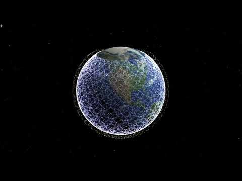
Mark Handley of UCL explains, with simulation visualizations, how early Starlink satellites without inter-satellite links could still give low-latency wide-area communication by hopping via ground relays. He shows it can beat fibre on many long paths.
 4:32
Web 2.0 ... The Machine is Us/ing Us
12.1M views • 19 years ago
Michael Wesch
Michael Wesch's five-minute video about Web 2.0, showing how the read/write web, XML and user-generated content change how people create and share information.